
There’s a slew of local travel magazines now at the store shelves vying for your attention. It’s no secret that this is the best time to travel. With cheap airfares and transport discounts, more than 8 publications are there to get a sice of your market to offer suggestions and features on travel destinations. Honestly, I’ve seen travel magazines come and go or replaced by new. I view travel magazines mainly for their value on a travel. Will it help me discover new destinations, get me there and give useful advice?
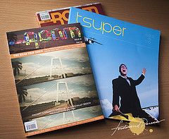
I was able to get a hand on a couple of new travel magazines from this young publication on the block October Eighty Publication. Let’s take a look at their title’s Tsuper and Roam.


Tsuper V2: Boracay Beyond the Bliss
Tsuper is actually a play on words “Travel” and “Super”. Spanning 135+ pages, the magazine is actually divided into two sections as well and you could also notice this on the use of paper. The T-Chronicles showcases facets of a featured destination and on this issue they focused on Boracay. The Superworld is the more high-end feature on architectural, futrue travel destinations and lifestyle trends.
Design
The magazine has a square dimension larger than your average magazine. Its spreads out well when it’s open. I must admit, at first look, the magazine can pique your interest. It has a very good design and layout. Easy on the eyes and used typefaces are easy to read. I even have to applaud them on an the Boracay Map they made. Very useful The only problem I have is the use of two types of paper.

Content
The articles on the main feature of Boracay has some interesting moments. I liked how they touched upon the indigenous Atis of the island, the Bom Bom culture, Nenette Graf’s environmental cause, the party scene, biking and the surrounding islands. Some articles are well written some are mediocre like I’m reading a manual but the topics touched are interesting. Definitely delivering something more than the usual Boracay articles on the beaches, food and resorts but more on the people and their personal stories. My complain here is that going towards the middle, the images doesn’t really coincide with the articles. Say Boracay on a Bike, doesn’t even show photos of actual biking on Boracay. I remember reading a similar article on Cebu Smile Magazine where it actually showed what its like to bike around Boracay.

Photography
Images capture the reader’s attention, that’s why good photography in a publication is quite essential. The images here on this issue are not bad but not spectacular either. I think it has to do partly with the paper they use. The non-gloss paper they used actually washes out the colors making all the shadow details look muddy. It’s not good for photographs. And when they did use the glossy paper on the Superworld section, it showed how low quality some of their photos are. I also noticed this before on their first issue where they blowed up some images but it turned out blurred and almost pixelized. It’s disappointing that on this issue again there was this architectural shot where the chromatic aberrations and highlight blow outs were very apparent. The art director could have cleaned the image up first or not have blowned it up on that size. I hope they use the glossy paper throughout and be more meticulous in details.
Value
The magazine retails for P350 and runs on a quarterly basis. For this issue if you are looking more into Boracay and yearning to discover what’s more in the island, there is definitely some interesting reads here. I’m having trouble on where to place this magazine though since its not really cheap but the contents are not all high end travel like say TraveLife which is a lot cheaper.

Just Go Roam: The Road Trip Issue
When I got the first issue of Roam, it reminded me a lot of the now defunct travel magazine “Go! Just Travel” The design, content and treatment is definitely geared towards the young and hip travelers belonging more so to the MTV Generation. On it’s second issue, they featured road trips, mainly around Luzon and the Indochina regions.

Design
The dimensions is like any other magazine which is good since it’s easy to take anywhere. The design is definitely grunge and more graphical than photographic. It’s very different which would surely appeal to artsy fancy people but the challenge of this magazine is readablitity. There are portions which text are obscured by the background which can be hard to read. It’s visually engaging but I think pulling back a little to give space would also help a bit. Also the treatment of a text spread then a photo spread is ok but the downside is it doesn’t have captions. Captions are very important that’s why when I was reading through the text I try to find out from the photos which is which. Never under estimate the value of a good caption in a photo.
Content
It’s road trip issue and the were laid out in a way they have traveled. Treat it as an itinerary with road trip stories from day to day written on a view point of different people who are on the same trip. The young voice traveler is there. There are some favorite writing styles there for me but there are also some that I feel like I’m reading a blog. Using phrases like “hehehe” or “haha” on a magazine article is immature. Aside from that there are interesting tips for DIY trips, and perspectives on Travel and Documentary photography. It’s a jam packed issue. Maybe too jam packed.

Photography
Roam also uses the same non-gloss type of paper Tsuper uses so it suffers a bit from the washed out colors and muddy shadow details only distracted by the bright graphics on each page. Photography here leans on the popular lomo and art photography and travel snaps. There are really good ones featured from JakeVersoza’s muted photographs to the images at the Travel and Documentary article.
Value
Roam would really be appealing to the young and adventurous travelers with it’s format. It knows it’s target market very well and for P150 per issue, it’s pretty crammed with stuff to read and look through.
Leave a Reply